Scaled and Icy Logo 3D Model
Introduction
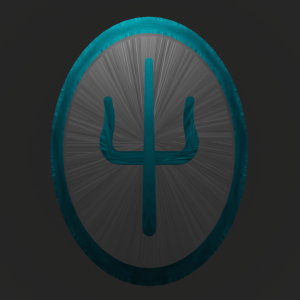
Hey, friend! The model I’m featuring here is actually a relatively new one that I made in September of this year. As you might remember, I created the logo for one of my favorite bands, twenty øne piløts’. The one I modeled based off their 2015 album Blurryface, but being that they change their logo with every album, I decided to recreate the new logo from their latest album, Scaled and Icy.
Building The Logo
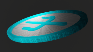
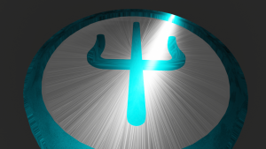
Before we get into anything, I’d like to disclose that the overall mesh is made up of three separate parts: The Greek Letter Centerpiece, the Silver Filling, and the Blue Casing. I’ll dive into the details later on, but here’s a photo of each of them in the 3 main steps.
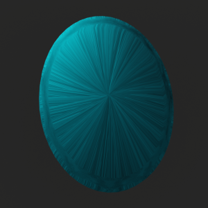
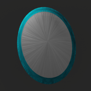
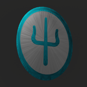
The reason I mention those pieces beforehand is because the building process was very structured. Unlike the other logos I’ve showcased, this one is not your standard circular logo. This one has an oval-shaped outline that is disconnected from the rest of the artwork. Additionally, the centerpiece in this logo is the Greek letter Ψ, which is pronounced “SAI,” just like the album’s acronym would be.
 |
 |
|
| Scaled and Icy Logo | 3D Model (Finished) |
 |
I started by creating the Greek letter centerpiece, working from the bottom-up to form the stem and then branching out. One of the best things about Blender is the fact that you can symmetrize your 3D object on both sides. In order for this to work, you have to be aligned to the origin that is relative to your desired symmetrical direction. For example, since I wanted my mesh to be exact on both the LEFT and the RIGHT, I had to make sure that the object’s origin was zero (0) on the x-axis. That way, when I set the symmetry tools accordingly, the system knows how much of the mesh it is reflecting and which side it’ll be reflecting to. |
|
Good news, Rusher! The forks of the centerpiece were certainly the hardest part of the project, so that means the rest should be easy! …Right? Well, not entirely… If there’s anything I’ve learned from Blender, it’s that for every great feat, there will always be a more powerful adversary waiting for you. If anything, though, that’s a good sign. Just like an actual video game, these achievements mean you’ve leveled up. ~ Auspicious Atlas |
 |
|
|
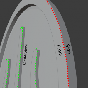
After finishing the Ψ centerpiece, I created the oval outline to surround the entirety of the object. I started this by placing a torus in the scene and doing my best to line it up with the ring depicted in the logo. Unlike the Foo Fighters logo, this outline didn’t have a rounded torus, so I had to edit it manually. I eliminated excess edges so that there’d only be 1 left, after which I pulled them out so it would form a straight edge. This ultimately corresponds to the design of the straight edges on the Ψ. |
 |
| As mentioned earlier, there are three parts to this mesh: The Greek Letter Centerpiece, the Silver Filling, and the Blue Casing. In this case (no pun intended), the thin blue shell in the back is part of the outline. But in order to know how thick I needed to make the back piece, I first needed to make the silver filling. | 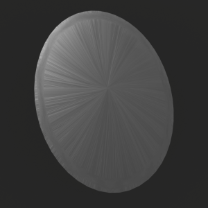
This oval-shaped backing is behind the centerpiece and surrounded by the blue shell. |
|
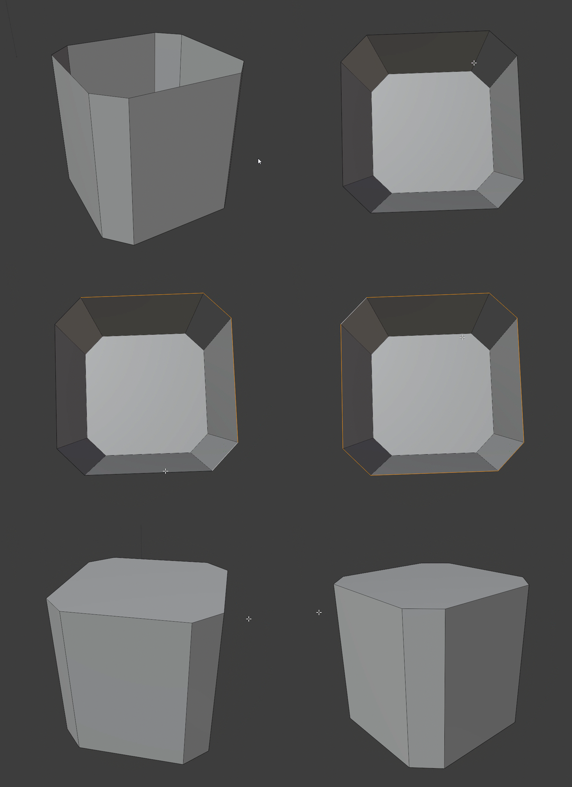
If you select two or more separate edges and then hit F, the selected area will be filled in. |
I did this by duplicating the existing outline and shrinking it down so that it fit just underneath. Then, I selected all of the inner edges, and filled them in. To the left, you’ll see an example of the process. Once the silver filling was in place, I was able to go back to the blue outline and select all the inner edges on the rear end, just like I did with the silver filling. |
|
Blue Casing Shell from the Front |
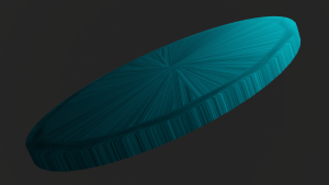
Blue Casing Shell from the Back |
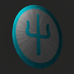
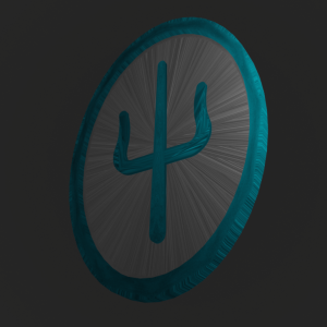
Result
Although the textures are still a bit wonky, the thing I’m most proud of is adding the filling in the back.

Atlas’ Magical Moral of the Story…
In the future, I’m going to work towards making the textures look more natural on curved surfaces and meshes with many edges. Additionally, this is the first time I actually built mesh in Rendered Mode as compared to Material Preview.
| In Material Preview, Blender creates a fake environment with lighting that is only meant to give you an idea of what your overall product might look like. On the other hand, Rendered Mode gives you the actual product.
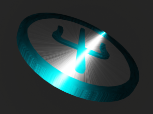
Because of this, I’ve started trying to learn how to use light sources, such as a spot light and an area light (otherwise, the entire composition would be dark). For example, the image to the right shows the effect that lighting might have on a mesh. One of the most amazing things about Blender is that they have a wide variety of built-in lighting properties that I can apply to objects. In this project, I just worked with standard metallic images and displacement, but I hope to expand my skillset on tweaking with the nodes and shading properties for Parallax. |
|
All-in-all, I’m incredibly happy that this logo has a shell, making it resemble a keychain (inspired by the review I left in my Blurryface model). I aim to use the symmetry and lighting tools again when creating objects and characters for Parallax.
Thanks for Reading!
~ Atlas from Atomic Rush Studios
“Rushers Stick Together”
